Role
UI/UX Designer, UX Researcher
Tools Used
Figma, Google Analytics, Canva, Photoshop
Industry
E-Commerce for Fashion
BACKGROUND
What is the E-commerce industry?
E-commerce, also known as electronic commerce, involves the buying and selling of goods and services over the internet. These transactions can occur directly between businesses and consumers (B2C) or between businesses (B2B). From purchasing new outfits to shopping for sneakers, e-commerce has undeniably woven itself into nearly every aspect of our daily lives, particularly in the realm of clothing and accessories.
How has e-commerce evolved over the past decade?
The e-commerce industry has undergone significant transformation over the past decade, driven by evolving consumer habits and rapid technological advancements. Today, we can make purchases on the go using our smartphones with a simple tap, shop directly within social media apps, and even try out products using virtual reality before buying them.
THE BRIEF
What am I going to do?
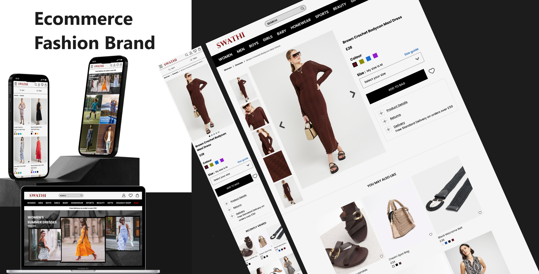
In this case study, I will discuss my project, outlining the objectives, the design process, and presenting the following deliverables:
* Home page
* Category page
* Product description page.
These designs are optimized for both mobile and desktop screens (responsive).
Furthermore, I will offer key insights into each stage of my method, covering business case studies and in-depth user research and design processes. I will take you through my eCommerce website on both desktop and mobile, showcasing how I use design thinking to solve user interface problems. This approach aims to satisfy user needs while also aligning with business goals and objectives.
The problem statement
Focusing on website navigation and product browsing, how can we apply design thinking to enhance the customer experience, ensuring that the site meets user needs while also aligning with core values such as beauty, clarity, functionality, and sustainability?
By highlighting the core value of ‘functionality’ and implementing it into the final design solution, business needs can be met.
THE HYPOTHESIS
My plan and predicted outcomes:
I aim to simplify user navigation and product browsing on the website by focusing on the navigation bar, product page layout, and filtering options. I will test my ideas and designs through questionnaires and interviews with users. The desired outcome is a navigation and browsing experience that feels familiar and functions similarly to other fashion eCommerce websites, ensuring a smooth user journey. Additionally, I will maintain the brand mission by preserving the website's 'luxury' and 'high fashion' feel.
BUSINESS RESEARCH
To better understand the business, conducting background research on the company is crucial. It involves understanding market trends, user behaviors, and competitor strategies to inform design decisions. This research helps identify the needs and preferences of the target audience, ensuring the design solutions are user-centric and effective.
Market Analysis
Studying current e-commerce trends, consumer purchasing patterns, and emerging technologies to stay ahead in the industry.
User Research
Conducting surveys, interviews, and usability testing to gather insights into user needs, pain points, and preferences.
Competitor analysis
A competitor analysis involves gathering quantitative and qualitative data about a company's direct and indirect competitors, specifically their products or websites in this context. Direct competitors are companies within the same industry, targeting similar customers and offering comparable products. Indirect competitors offer similar products but may operate in different industries or target different customer segments.
A competitor analysis reveals where a specific product excels, identifies strengths and weaknesses, and uncovers the factors contributing to a competitor's success. Utilizing this research method, I can leverage insights from the collected data to inform UX design decisions effectively.
Behavioral Insights
Analyzing user interactions and feedback to refine design elements, ensuring an intuitive and engaging user experience.
USER RESEARCH
Next, I conducted a user analysis to understand what users value in critical tasks within their journey. This data helps guide my usability testing and focuses on essential features in the design.
I compiled a list of key features from well-known fashion brand websites that I deemed crucial for a successful fashion eCommerce site and relevant to this project. I then gathered a sample of regular shoppers to rank these features based on their frequency of use.
User behaviour analysis outcome
From my analysis, I found that the navigation and search bar were frequently used by everyone, confirming my initial assumptions. The wish list feature, while only used occasionally, was utilized by most of the sample, suggesting that it enhances the user experience in some way.
The primary takeaway was that the 'sort products by' option, along with the navigation bar and search bar, were the most highly prioritized features.
Questionnaire
The next stage of my user research involved distributing a questionnaire I created using Google Forms. Questionnaires are valuable for gathering both qualitative and quantitative insights, which can be used at various stages of design testing, and even before beginning design work. This questionnaire allowed me to collect data on the pain points users experience and their interactions with other online clothing stores. To ensure the accuracy of the data, I avoided making assumptions and crafted unbiased questions.
Possible questions include:
1. What is the first thing you do when landing on an online clothing store’s website?
2. Think about the last time you shopped for clothes online. What was the name of the store, and did you have a good experience?
3. If you had a negative experience, could you explain why in a short sentence?
4. When browsing products, what factors are most important to you?
5. Is there anything that could be added to the website to improve your shopping experience?
6. If you could change one thing to improve the website, what would it be?
The results of my survey confirmed my hypothesis: many users had difficulty navigating the website. Additionally, 90% of participants valued the ability to sort and filter items while shopping, making this a high-priority issue to address.
The main pain points identified in the survey were:
* Difficulty navigating the site
* Inability to sort items from newest to oldest
* Unclear layout
* Overly small font sizes
Many of the reviews on Trustpilot also support the findings from my survey. Issues with navigation and unclear layouts were frequently mentioned, contributing to a poor user experience for many reviewers.
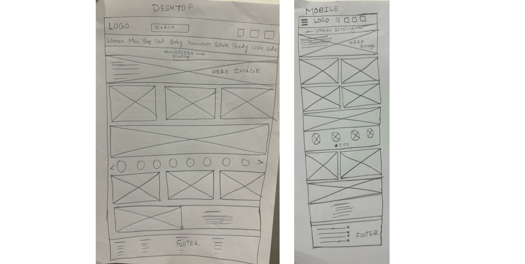
WIREFRAMES
Low Fidelity Wireframes
To begin the initial design phase, I created multiple hand sketches to incorporate all the crucial elements that meet the requirements and align with the business case studies. I then selected the top three designs and combined elements from each to develop a layout I was satisfied with. It was essential to consider the research results to ensure I addressed the initial problems and avoided inadvertently creating new ones.
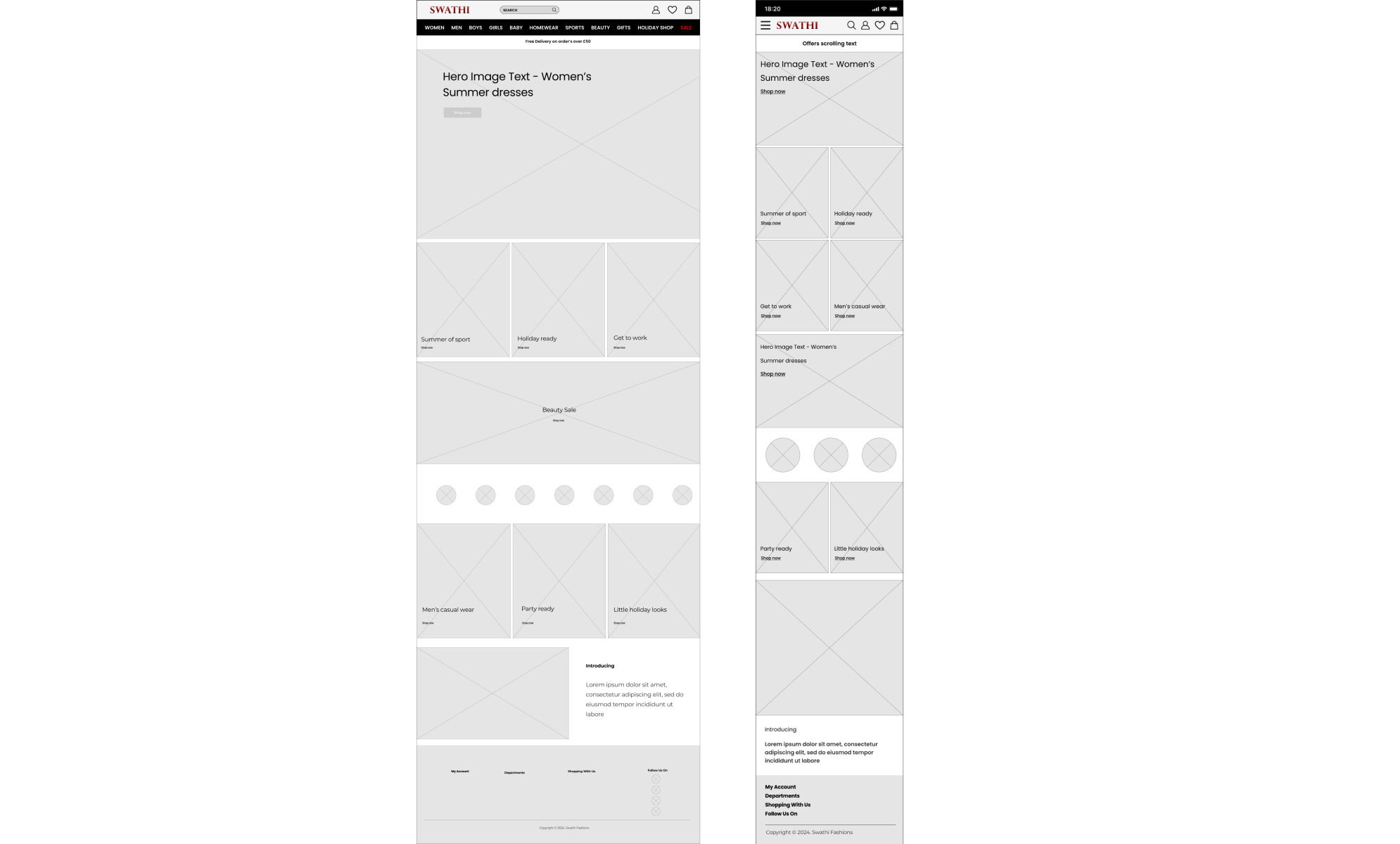
Mid Fidelity Wireframes
Moving on to the next stage, I began to develop my low fidelity sketches into mid fidelity wireframes using Figma. During this process, some design changes were made. I drew squares in the header as placeholders to represent where the icons for 'Log-in/Account,' 'Wishlist,' and 'Shopping Bag' would be located.
At first I opted for text instead of icons because it better matched the brand's clean and minimal aesthetic. However, while creating the wireframes for mobile, I quickly discovered that the text wouldn't fit in the header unless it was very small and unreadable, or I would have to remove the search bar from its central position. An alternative was to use icons for the mobile website only. To maintain consistency between the web and mobile versions, I decided to use icons for both.
To ensure consistency and accuracy across different screens, I used a baseline grid and adhered to iOS guidelines. Utilizing grids and guidelines allowed me to ensure that padding, margins, and elements were evenly spaced and well-aligned.
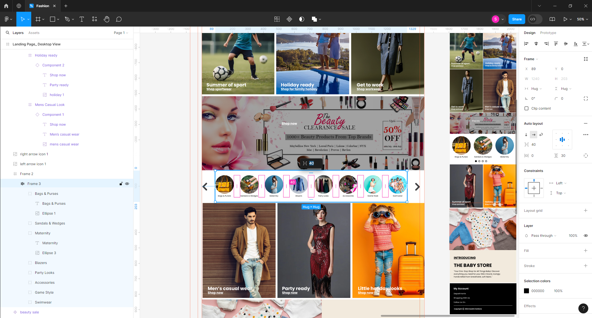
High Fidelity Wireframes
High-fidelity wireframes are detailed and polished representations of a digital product's layout and design. Unlike low-fidelity wireframes, which provide a basic structure, high-fidelity wireframes include intricate details such as typography, color schemes, imagery, and precise spacing. These wireframes serve as a bridge between the conceptual design and the final product, offering a clear and comprehensive visual guide for developers and stakeholders.
High-fidelity wireframes play a crucial role in the design process by allowing for thorough review and feedback, minimizing misunderstandings, and ensuring the final product aligns with the envisioned user experience and business objectives.
UI PHASE
Design Fundamentals
The laws of UX/UI were integral to my designs, from initial sketches to wireframes. The key laws I focused on were:
1.Hick’s Law — This law states that the more options users have, the longer it takes for them to make a decision. To streamline the user journey and reduce decision-making time, I ensured the design was minimal, presenting only essential information. This minimizes the risk of overwhelming users. This law's application is evident in the minimalist layout of each screen and the navigation bar.
2.Miller’s Law — Miller’s Law states that the average person can hold about seven objects in their working memory, also known as the Magical Number 7 (plus or minus 2). Organizing content into smaller chunks helps users process, memorize, and understand content more easily. I implemented this law by limiting the navigation items to six main categories.
3.Law of Common Region — This law suggests that elements within the same region are perceived as a group. I applied this in various design areas, such as the header, where the logo, search bar, login, and shopping cart are enclosed within a black-bordered element. The navigation bar is similarly grouped. In the ‘Trending Items’ section on the homepage, a black background separates it from the rest of the page, creating a distinct common region.
4.Aesthetic Usability Effect — According to Huroso and Koari's study, users perceive aesthetically pleasing designs as more usable and functional at first glance. This means users have a more positive emotional response to visually appealing designs, making them more forgiving of minor usability issues. This principle aligns with my brand core values of 'beauty' and 'clarity.' I carefully used the brand colors of black and white, predominantly employing white through ample white space, creating a luxurious, high-fashion, and clean design.
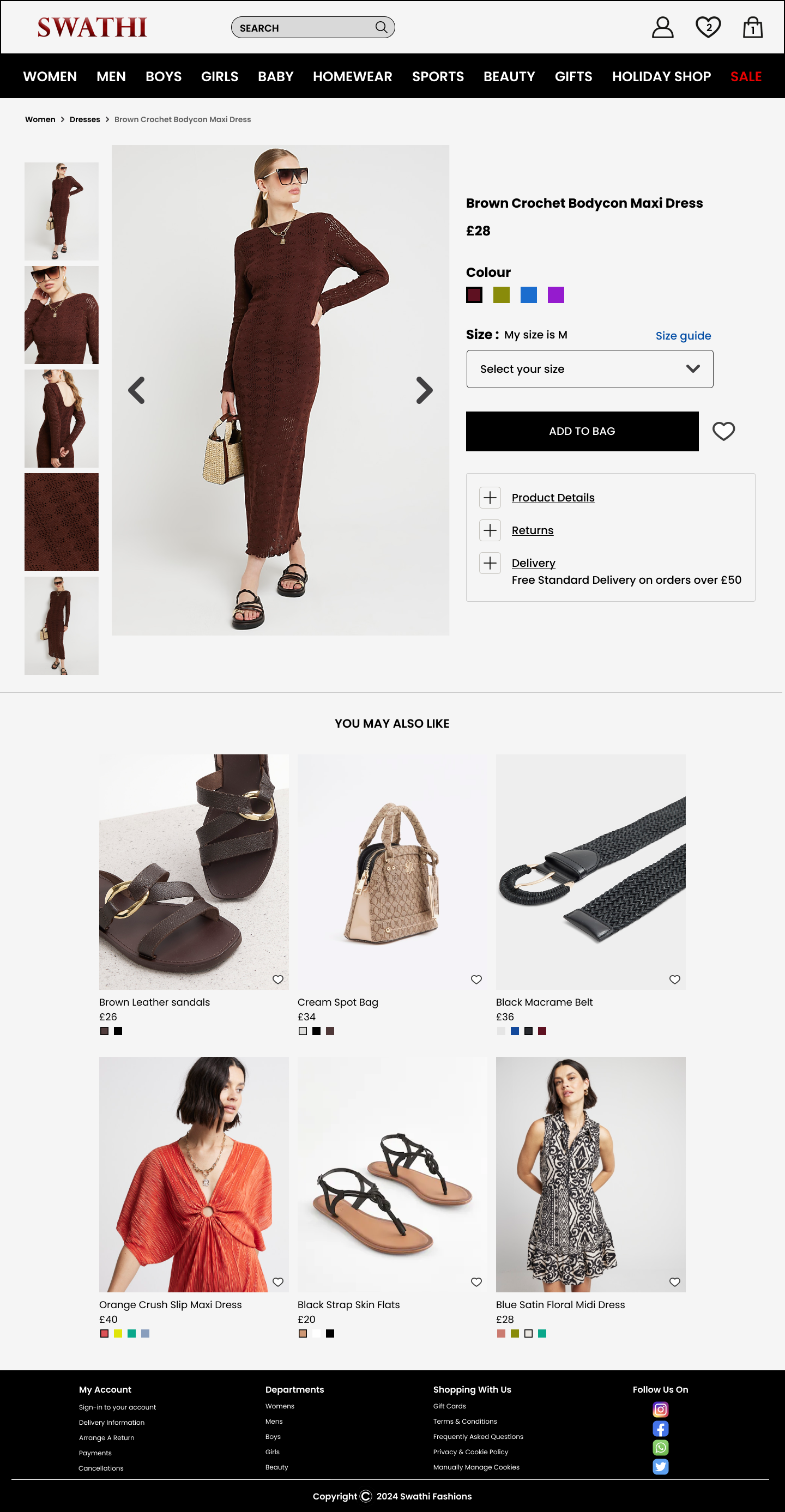
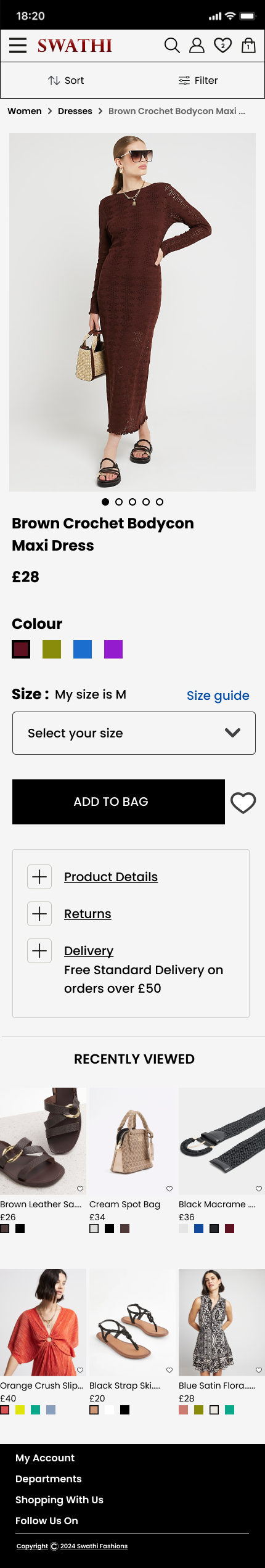
5.Jakob’s Law — Jakob Nielsen’s study concluded that users transfer their expectations from familiar products to new ones, expecting similar functionality. To apply this law, I incorporated elements from competitors website product pages and sorting/filtering features. This can be seen in images 3, 4, 5, and 6.
By adhering to these laws, I aimed to create a user-friendly, aesthetically pleasing design that aligns with the brand values while ensuring functionality and ease of use.
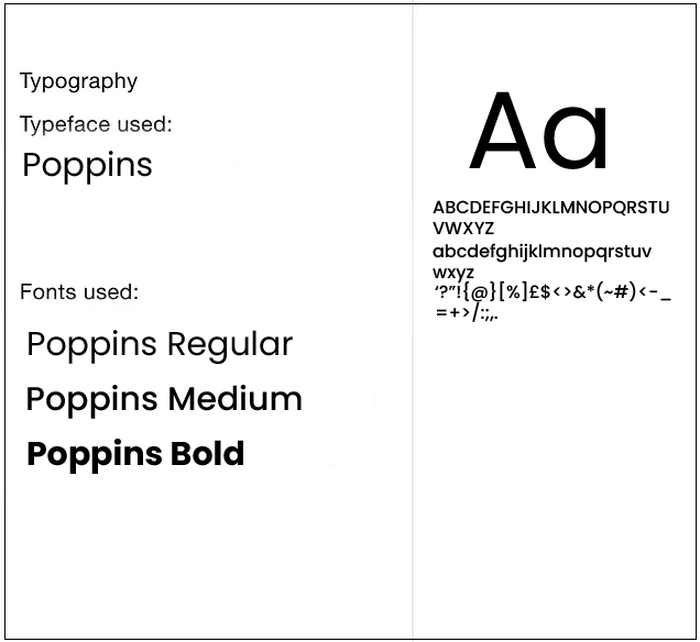
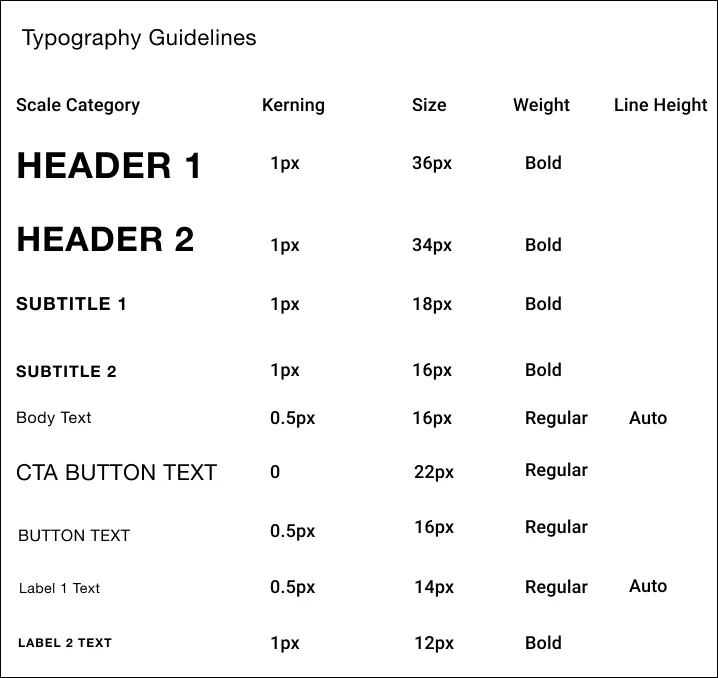
Typography
I choose Poppins, a Geometric sans-serif typeface, for its readability and variety of font styles. This typeface's range allowed me to use regular, bold and medium weights and adjust kerning and line height to establish hierarchy in different design sections. This is particularly evident on the product page in the item description.
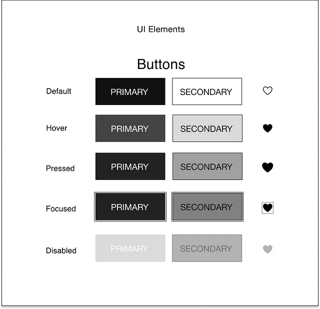
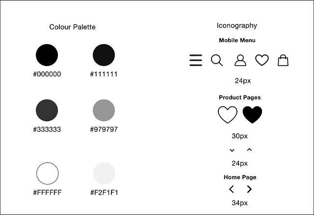
Style Guide
WCAG, Accessibility, and Inclusive Design : Throughout the design process, I was careful to keep accessibility guidelines in mind, as accessibility shouldn’t be an afterthought in design
In terms of color choices for the designs, I ensured high contrast between colors to maintain accessibility for users with visual impairments. The palette predominantly consisted of black and white, with varying shades of grey in between.
I opted against using a carousel on the homepage and instead utilized a hero image or banner as the primary call to action. Carousels often embed text within images, making it inaccessible to users who rely on screen readers. By designing my hero image/banner with separate text elements overlaid on top, users using screen readers can access the information. Additionally, I added a transparent white background behind the text to enhance visibility for those with visual impairments.
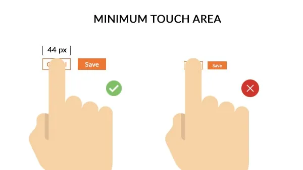
Font size was a crucial consideration, with sizes set at 14px and above for mobile and 16px and above for desktop, except for small labels which were set at 12px on mobile. Ensuring target sizes for call-to-action elements (44px) was also important. I conducted tests using Figma Mirror on mobile screens to verify that icons and buttons were sufficiently large for easy tapping.
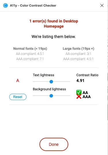
I used a Figma plugin called Contrast Checker on each frame to make sure that my screens met accessibility standards, as seen above.
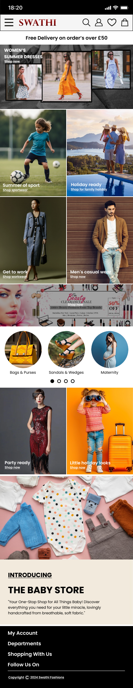
FINAL PRODUCT
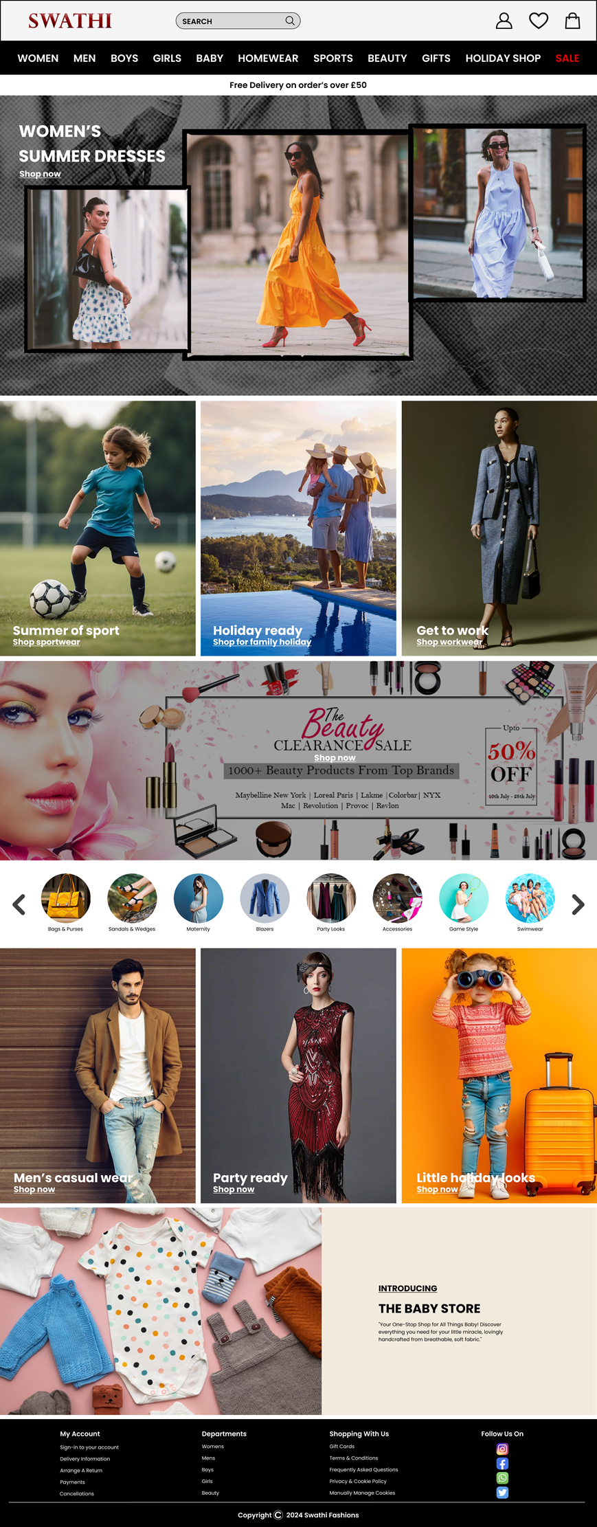
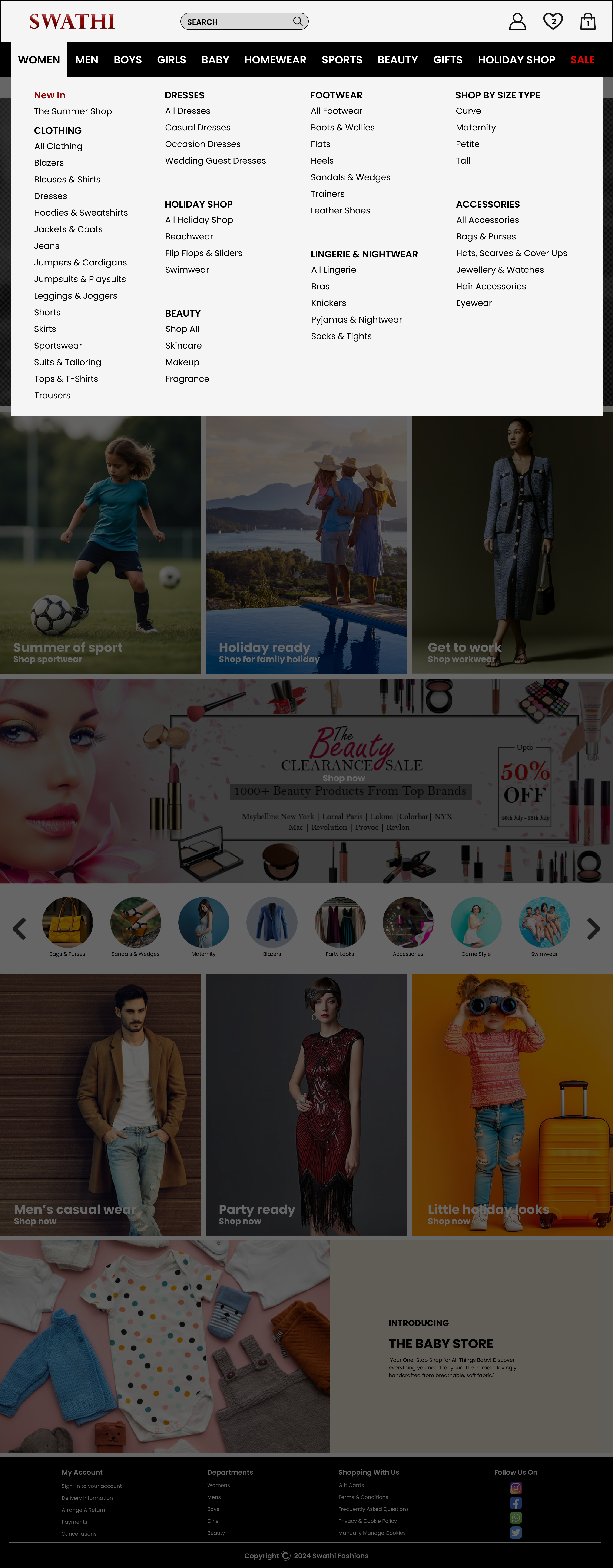
Homepage - Desktop / Mobile
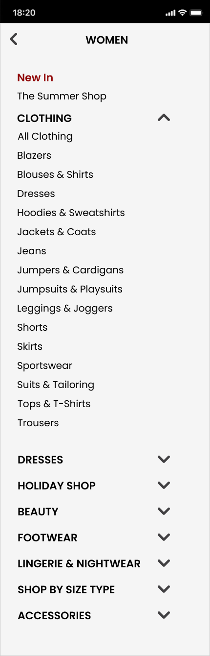
Expanded category Menu on Hover - Desktop / Mobile
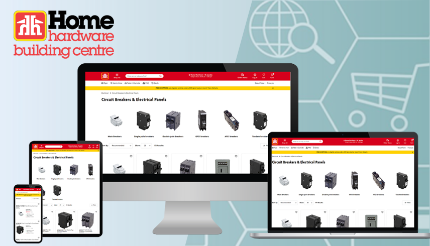
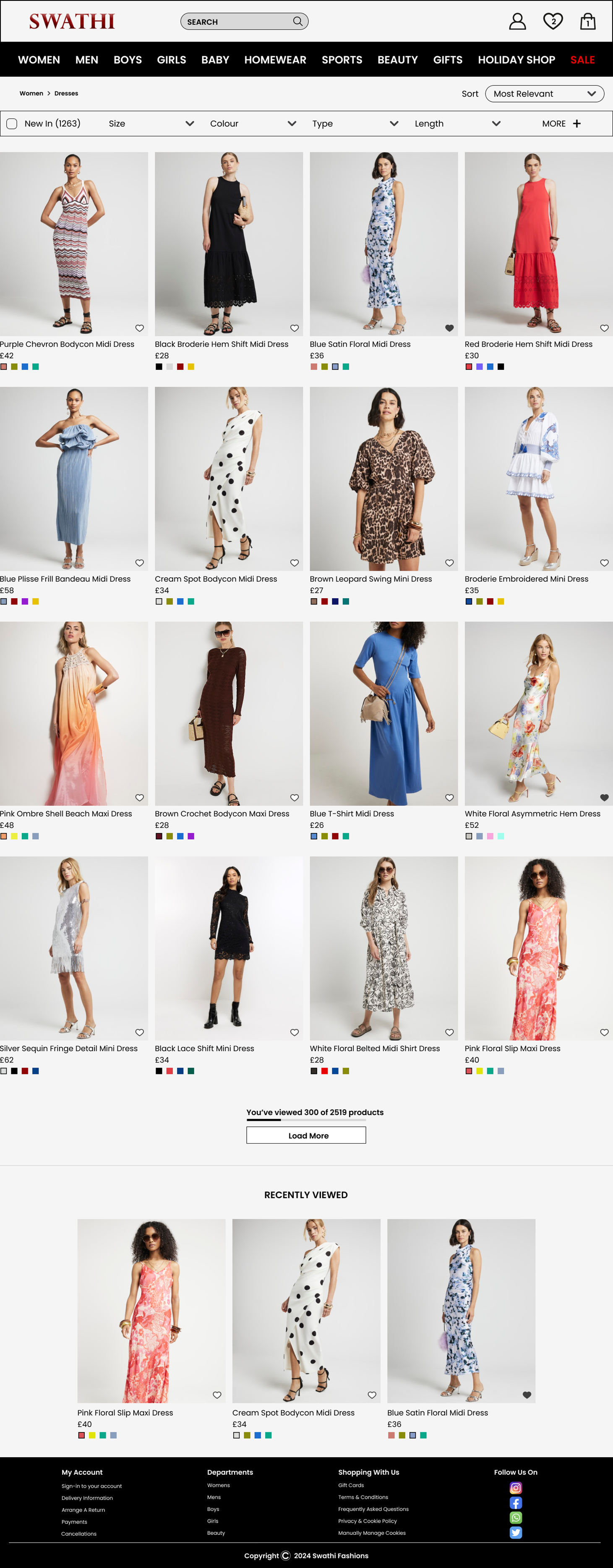
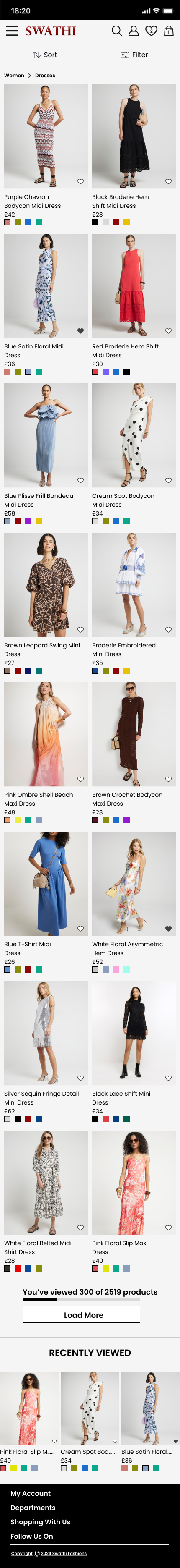
Category Page - Desktop / Mobile
Product Description Page - Desktop / Mobile